
fats of life

Fats of Life is a science-based health publication for medical practitioners (not the spinoff to your favorite 70s boarding school sitcom—sorry!). The purpose of their site is to be the place for healthcare professionals to get information about omega-3s to give to their patients. They are very clear about the site being meant for professionals in the healthcare industry and not meant to be taken as medical advice by consumers.
They wanted a UX audit performed on their site so that they could make some improvements. For a better flow, my goal was to make most of the important information appear on the screen before a user would have to scroll , or above the fold. Most of what I did for a better visual user experience was improving the consistency.
Social impact: Owned by the Global Organization for EPA (eicosapentaenoic acid) and DHA Omega-3s (GOED), the people behind Fats of Life are acutely aware of the more than 95% of Americans who are not getting enough omega-3s. GEOD’s mission is to encourage Americans to get the EPA and DHA to address this public health need by empowering healthcare practitioners to understand the benefits and importance of EPA and omega-3s.
The Problem:
Fats of Life’s website had an inconsistent visual design and an overwhelming amount of textual information for users to navigate through.
My Role:
UX Design Consultant
User Interviews, Persona, Prototyping, Visual Mockups
The Challenge:
As this was an audit, I didn’t have the access or resources to as many users as I would typically seek out. Also, being that the users were in such a specific category—healthcare practitioners—the readiness of users within the timeline of the project provided a potential issue as well.
Project:
Platform: Website | Type: Healthcare | Length: 2 weeks
User Research
Target Audience
I conducted interviews with people in the healthcare industry. I spoke to each of the following:
Doctor
Nurse
Neonatal Epidemiologist
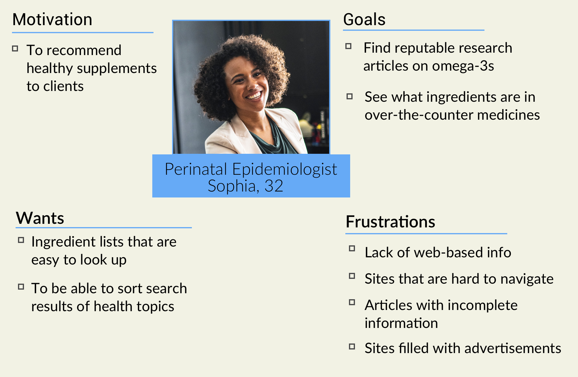
User Interviews
It was important to incorporate the goals and frustrations people in the healthcare field have when looking for information on over-the-counter supplements. Conducting these user interviews, I was able to gather their motivations, frustrations, wants, and goals. I took my key learnings and applied them to a user persona.
user persona
home page mockup

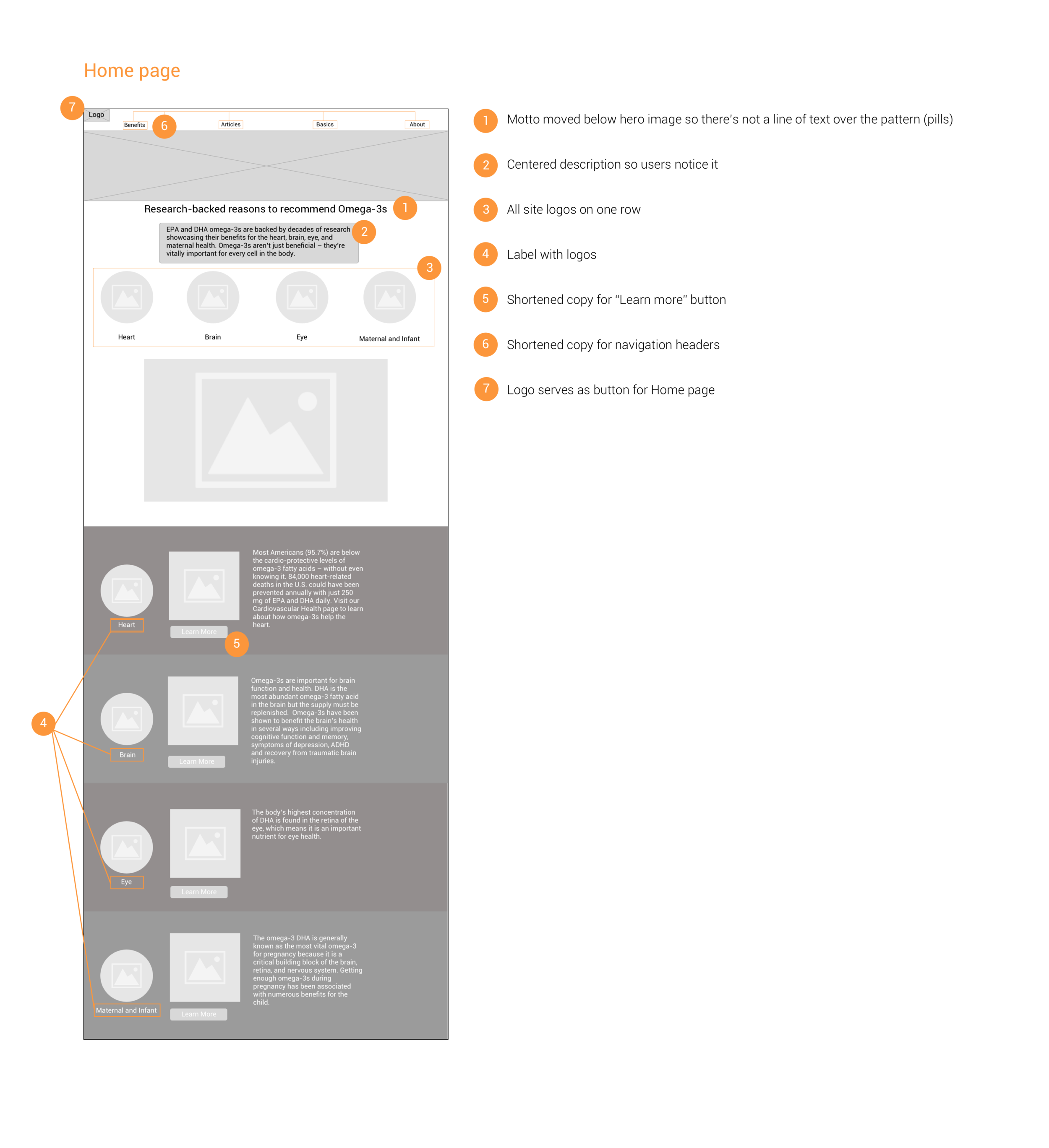
Home Page
The original image was one of pills, which makes the text harder for users to read than if it were over a solid color.I suggested having a hero image with the text below it, as opposed to over the image.
annotated wireframe - home page
Wireframes

There needed to be links to each of the different subtexts at the top of their respective pages to make it easier to navigate. This improvement won’t leave the user feeling overwhelmed with the large amounts of texts all at once. This feature also allows the user to easily navigate to and from various topics.
Annotated Wireframe
I created this annotated wireframe so that the client could quickly and easily see and understand my design recommendations. Explaining why certain design decisions are effective gives clients insight to the users’ journeys as well as my thinking process. With this wireframe, I lay out a mockup of what a redesign screen will look like based on my user interviews and research. The biggest recommendation here is to design the site so that it is more organized with just enough options for users to be able to navigate to and from different areas and pages of the site. As we’re working with a site based on giving information, the original design had the user scrolling through loads of text and they could easily lose their place if they decided to go back or go somewhere else within the site.

Recommendations

visual mockup for shorter copy (above)
I wanted the client to see what a page would look like with shortened copy, so I made a mock-up of how that would look. With a shorter block of text, the user has less to worry about in terms of time spent seeing if a certain article is the one they want to read, improving navigation ease. It also leaves more negative space for a cleaner, less clunky design.
Next Steps
Moving forward, card sorting will be useful to learn what copy healthcare professionals are most used to in order to continue to improve the user journey. Keeping on top of interactive technology that these users would find helpful, developments/trends and UX/UI best practices in the digital landscape of healthcare, and evaluating suitability for Fats Of Life would be of significant use as well.